Card
<ns-card> 
Overview
Cards can be used to contain content in a consistent and structured way.
Cards are to be used to apply a container around a related grouping of information. Achieve this through a combination of imagery, illustrations and typography.
Examples
To group content within a visual container.
To add an illustrative icon to illustrate the content of the card.
To add an image to illustrate the content of the card.
To add a pill above the heading to highlight a status or characteristic of a card.
To add a pill that is over the image.
To indicate that the card contains content that is inactive.
To group content only using visual proximity, with no background.
To get a different responsive behaviour on basketball-court viewport.
Guidance
Standard
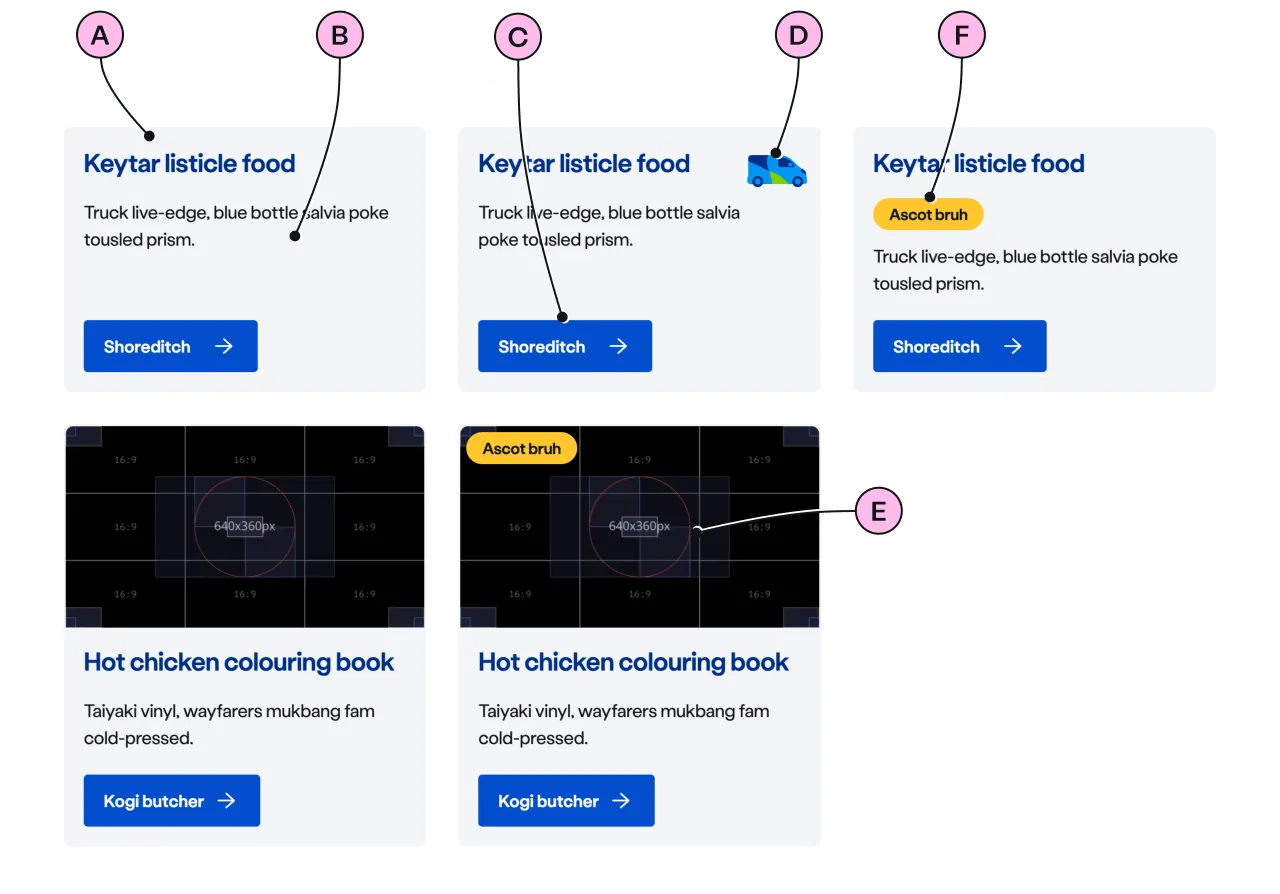
Key
| Key | Field type | Guidelines |
|---|---|---|
| A | Heading | The recommended length is between 4 and 12 words, not exceeding 50 characters in total. |
| B | Paragraph | A single, short paragraph works best. The text length should not exceed two paragraphs of 3 lines. Include emphasis with <strong>, inline links <a>, lists <ul> <ol>. Add a caveat link if required. |
| C | CTA | Keep the text short, relevant, and actionable. It should not exceed 24 characters. |
| D | Decoration | Use to support and highlight the content. See illustrations. |
| E | Image | Use an image size of 640 x 360px. Images should be WebP file type, the file size should be no more than 25kb. |
| F | Pill | Use a pill to highlight a small item of information to a customer. |
Support
The support card has a responsive behaviour at basketball-court viewport, to enable a better layout for tablet-sized devices.
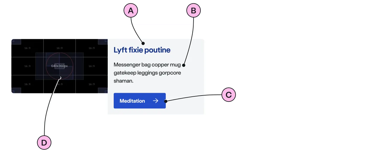
Key
| Key | Field type | Guidelines |
|---|---|---|
| A | Heading | The recommended length is between 4 and 12 words, not exceeding 50 characters in total. |
| B | Paragraph | A single, short paragraph works best. The text length should not exceed two paragraphs of 3 lines. Include emphasis with <strong>, inline links <a>, lists <ul> <ol>. Add a caveat link if required. |
| C | CTA | Keep the text short, relevant, and actionable. It should not exceed 24 characters. |
| D | Image | Use an image size of 640 x 360px. Images should be WebP file type, the file size should be no more than 25kb. |
Flat
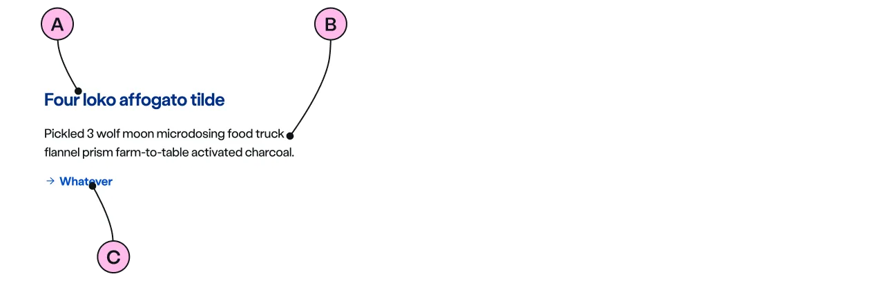
Key
| Key | Field type | Guidelines |
|---|---|---|
| A | Heading | The recommended length is between 4 and 12 words, not exceeding 50 characters in total. |
| B | Paragraph | A single, short paragraph works best. The text length should not exceed two paragraphs of 3 lines. Include emphasis with <strong>, inline links <a>, lists <ul> <ol>. Add a caveat link if required. |
| C | CTA | Keep the text short, relevant, and actionable. It should not exceed 24 characters. |
Considerations
- Keep the type of CTA consistent across a group of cards.
- Always add heading to the group of cards inside the panel.
- Place the pill in the same location across the group of cards to improve the readability of the cards.
Implementation
Placement
The ns-card component can be used in the following components:
Specification
Attributes
decoration
- Property
decoration- Description
- The name of the illustration to display on the card.
- Type
string- Options
- Refer to our illustrations.
pill-over-image
- Property
isPillOverImage- Description
- The toggle to display the pill over the image of the card.
- Type
boolean- Default
false
inactive
- Property
inactive- Description
- To indicate that the card contains content that is inactive.
- Type
boolean- Default
false
inactive-message
- Property
inactiveMessage- Description
- The message to display when the card is inactive for screen readers.
- Type
string- Default
This item is inactive.
image
- Property
image- Description
- The URL of the image to display on the card. Image ratio should be `16 / 9`.
- Type
string
alt
- Property
alt- Description
- The alternate text of the image and needs to be related to the visual content in the image.
- Type
string- Default
background
- Property
background- Type
boolean
type
- Property
type- Description
- The type of the card.
- Type
string- Options
standardsupportflat- Default
standard
Slots
| Slot | Permitted tags | Description |
|---|---|---|
heading | <h2> <h3> | The heading of the card related to its content. Heading level depends on its place in the semantics of the page. |
paragraph | <p> | The content of the card. |
cta | <ns-cta> <a> | The call to action content for the card. |
action | <ns-cta> <a> <ns-form> | The action content of the card. |
Accessibility
inactive
The inactive attribute indicates that the card’s content is inactive. The card will appear greyed-out to indicate this to a sighted user.
For a screen reader user the value of inactive-message provides context about why the content is inactive. This message will be read out by screen readers after announcing the heading. This inactive-message is hidden from sighted users.
<ns-pill>
Be careful adding <ns-pill> within the heading slot, as the content of the pill will be read out as part of the heading for screen readers.
In this example using Safari on a Mac with VoiceOver it will read out:
Heading level 3, 2 items - Special Offer Get energy with us. You are currently on a heading level 3.
<ns-card> <h3 slot="heading"> <ns-pill>Special Offer</ns-pill> Get energy with us </h3> ...</ns-card>Make sure that is what is expected. Remember the pill cannot be used on its own within a heading.
Our advice is to rarely include pills in headings, as they typically convey a message related to the heading but are not part of the heading content itself.
Last updated: