Tabs
<ns-tabs> 
Overview
Tabs provide organisation of content separated within the same context.
✨ This is an auto-generated AI summary of the ns-tabs's documentation. It may not be accurate. ✨
The ns-tabs component separates related content into clearly labelled sections. It comprises multiple ns-tab components.
Examples
Guidance
Standard
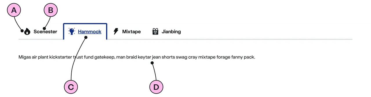
Key
| Key | Field type | Guidelines |
|---|---|---|
| A | Icon | Optional. Related to the label. See our icons. |
| B | Label | Use 1 or 2 words to infer the content of the associated <ns-panel>. |
| C | Selected Tab | This is the visual state of a selected tab. Used to show the user which content is visible below. |
| D | Panel | This is the area in which the content for each <ns-tab> will be displayed. |
Implementation
Placement
The ns-tabs component can only be used as a child of the <main> element.
Specification
Attributes
open
- Property
open- Description
- The index of the tab to open.
- Type
number- Default
0
type
- Property
type- Type
string- Default
standard
Slots
| Slot | Permitted tags | Description |
|---|---|---|
tab | <ns-tab> | The set of tabs displayed in the order they are added. |
panel | <ns-panel> | The set of content panels. The panels are mapped to the respective tabs in the same order as they are added. |
Events
| Name | Description |
|---|---|
tabchange | Dispatched when the selected tab is changed. |
Last updated: