Panel
<ns-panel> 
Overview
Panel is a decorative empty container that holds each section of a page.
✨ This is an auto-generated AI summary of the ns-panel's documentation. It may not be accurate. ✨
It provides an area to place a layout, add an optional decoration and apply the appropriate margins. There can be more than one ns-panel on a page.
Examples
Guidance
Standard
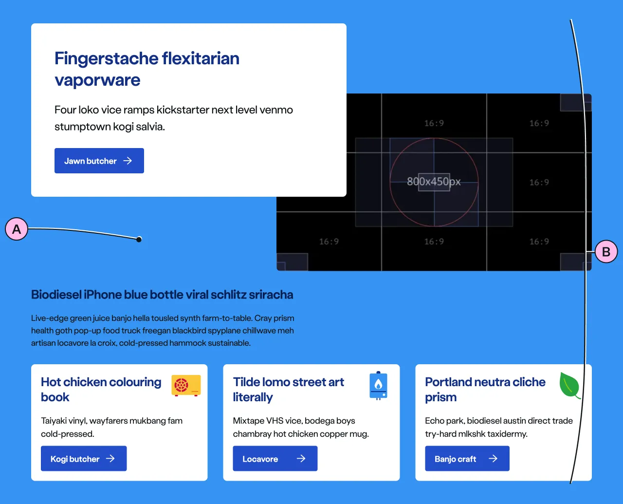
Key
| Key | Field type | Guidelines |
|---|---|---|
| A | Decoration | Choose between a no-colour background (default) or one of the decoration options. |
| B | Anonymous slot | Items placed in the anonymous slot can include a variety of different types of content and components. |
Implementation
Placement
The ns-panel component can be used in the following components:
<main><ns-tabs>
Specification
Attributes
decoration
- Property
decoration- Description
- The decorative background colour of the panel with optional top and bottom offset percentages.
- Type
string- Options
cyanlimenavyblueforestorangeredyellowwhitegrey-light- Default
type
- Property
type- Type
string- Default
panel
Slots
| Slot | Permitted tags | Description |
|---|---|---|
| Anonymous slot | <div> <ns-column> <ns-content> <ns-lockup> | The anonymous slot for content. |
Last updated: